-
Blue Note Records carries one of the most iconic visual identities in music history. Any reinterpretation risks either leaning too heavily into nostalgia or stripping away the character that made the label culturally significant. The challenge was to design an album system that respected Blue Note’s modernist roots—its use of grids, typography, and photography—without simply replicating the past. The work needed to feel confident and current while preserving the intelligence, depth, and restraint associated with both the music and the label.
-
The strategy focused on reduction and structure. Instead of expressive illustration or overt visual gestures, the design leans into modular layouts, disciplined typography, and a limited color palette inspired by classic Blue Note releases. Photography is treated as rhythm rather than decoration, arranged in a grid that mirrors musical phrasing and improvisation. Space, contrast, and alignment become the primary storytelling tools, allowing the design to reflect the clarity and complexity of Bud Powell’s work without distraction.
-
The final system presents the album as an editorial object—precise, balanced, and quietly expressive. Archival imagery is paired with a modern grid and restrained color blocks to create visual movement without excess. Typography is purposeful and minimal, reinforcing hierarchy and readability while letting the music remain the focal point. The result is a contemporary reinterpretation that feels timeless, honoring Blue Note’s legacy through clarity, structure, and respect for the craft.
This redesign reimagines a Bud Powell album for Blue Note Records through a contemporary lens while honoring the label’s modernist legacy. The project explores how structure, restraint, and rhythm can translate the complexity of jazz into a clear, timeless visual system that feels editorial, intentional, and enduring.
-
Cider is a crowded shelf and a crowded scroll. Most brands lean on the same visual shortcuts: rustic orchards, vintage wood type, apples, burlap, a predictable “craft” look that blends into everything else. Blossom Barn needed to feel instantly recognizable from six feet away and still hold up close, while also avoiding the trap of looking like every other local cidery trying to sound old-fashioned. The identity had to work across very different moments: bottle labels, tasting room signage, menus, merch, and social content, with enough flexibility for seasonal releases and event materials. On top of that, production realities mattered. The mark needed to reproduce cleanly at small sizes, print well across substrates, and stay legible in a range of color applications without requiring constant designer intervention.
-
Create a bold, ownable symbol rooted in the product’s origin story, not in generic cider imagery. The pear blossom becomes the anchor: a simple, memorable mark that communicates “orchard” and “bloom” without leaning on cliché. Pair it with a confident, beautiful palette that feels optimistic and modern, borrowing from heritage cues without looking dusty. The colors are intentionally high-contrast and friendly, designed to pop on shelf, photograph well for digital, and remain consistent across print and packaging. Then build a system around that mark: typography, spacing rules, and repeatable layout patterns that can stretch from a single label to a full set of brand guidelines, so the brand stays cohesive as it scales.
-
A visual identity system led by a strong pear blossom mark and a disciplined set of applications. The logo suite includes primary and secondary lockups for different contexts, plus clear usage rules so the mark stays recognizable whether it appears on a label, a poster, or a social tile. The color palette gives Blossom Barn an immediate signature and supports flexible, seasonal design without losing brand recognition. Packaging and collateral templates were developed to keep production fast and consistent, with layout structures that accommodate changing product info and campaign messaging. The result is a cidery brand that reads clearly, feels distinctive, and holds together across touchpoints while still leaving room for variation and growth.
Blossom Barn Cidery needed an identity that felt as crisp as the product and as memorable as the place it comes from. This case study shows how the brand moved from “just another cider on the shelf” to a clear, ownable visual system built around a bold pear blossom mark, a confident color palette, and a set of practical guidelines that scale from labels to real-world touchpoints.
-
The primary challenge was to differentiate Visionaire from the visual sameness found in much of contemporary art publishing. Many art journals rely on rigid grids, restrained layouts, and minimal intervention, often resulting in publications that feel interchangeable regardless of content. While clarity and legibility are essential, this approach can distance the reader from the emotional and conceptual weight of the work being presented.
Visionaire needed to hold complex, text-heavy essays and diverse imagery without becoming static or academic in tone. The challenge was to create a design system that supported long-form reading while still allowing space for disruption, contrast, and visual tension. The publication had to feel intellectually serious, visually expressive, and durable enough to function as an archival object rather than disposable media.
-
The strategy was to develop a flexible editorial system that balances discipline with experimentation. A restrained but expressive color palette was used to establish hierarchy and mood shifts across sections, helping guide the reader intuitively through the publication. Color is employed sparingly, acting as emphasis rather than decoration.
Typography anchors the experience. Clean, modern typefaces support extended reading, while intentional changes in scale, alignment, and spacing introduce rhythm and variation. White space is treated as an active element, creating pauses that counterbalance dense content and allow ideas to breathe.
Layouts were designed to feel composed rather than templated. Imagery is given room to expand, fragment, or recede depending on context, reinforcing the idea that each spread responds to the content it holds rather than forcing consistency for its own sake.
-
The final design positions Visionaire as a publication that is both rigorous and expressive. Each spread operates as a deliberate composition, integrating text and image in ways that reflect the themes of abstraction, interpretation, and cultural analysis present in the editorial content.
The system allows for variation without visual chaos. Structured grids provide stability, while selective moments of disruption re-engage the reader and prevent fatigue. Subtle color interventions and typographic restraint maintain clarity, even in dense sections, while full-bleed imagery and asymmetrical layouts introduce moments of intensity and focus.
The result is a magazine that feels intentional, tactile, and culturally literate. Visionaire functions not only as a platform for art and writing, but as a designed artifact that contributes meaningfully to the experience of reading and interpretation.
Visionaire is aN art publication that treats editorial design as a form of authorship rather than a neutral container. Conceived as a space where art, theory, and design intersect, the publication explores how visual rhythm, pacing, and material decisions can shape meaning alongside written content.
Rather than separating design from editorial intent, Visionaire positions the magazine itself as an expressive object. Each issue is meant to be read, experienced, and physically handled, with layout and structure playing an active role in how ideas unfold across the page.
-
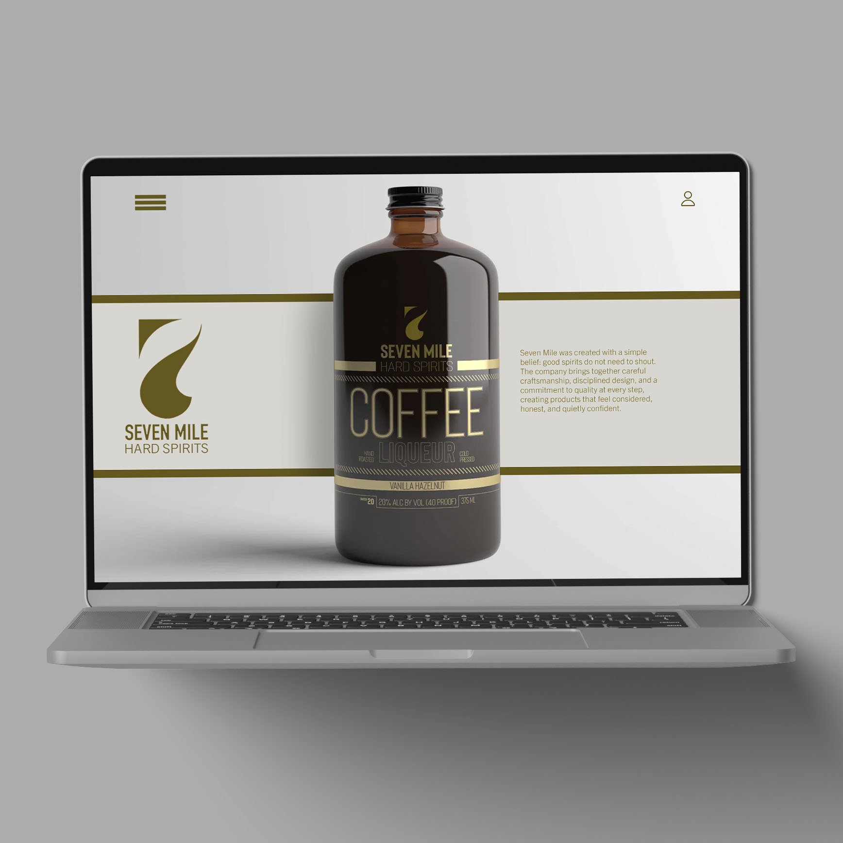
Coffee liqueur lives in a tricky visual neighborhood. A lot of bottles fight for attention with heavy ornament, loud flavor cues, or novelty energy that can make the product feel sweet before it feels serious. The challenge here was to design something that still communicated indulgence and warmth, but did it with discipline. It needed to stand out in a sea of dark labels and metallic accents while staying confident, minimal, and contemporary. It also had to make the information hierarchy feel effortless, because on shelf you get seconds, not minutes.
-
The strategy was to build a modern system that is more architecture than decoration. Lead with typographic structure, not illustration. Use a narrow set of cues, strong hierarchy, clean spacing, and intentional restraint so the premium signal comes from clarity and proportion. Keep the label dark and grounded, then introduce metallic accents as controlled highlights rather than a blanket effect. That balance gives the bottle presence from a distance and craft up close, while leaving room for future flavor extensions to plug into the same framework without redesigning the world every time.
-
The final design centers on a crisp typographic stack with a clear reading order: brand first, product second, flavor third, then supporting details. A dark field creates weight and confidence, while gold foil elements provide just enough lift to feel elevated and giftable. The layout uses consistent alignment, deliberate negative space, and fine linework to create tension and precision without noise. The result is a bottle that feels contemporary and editorial, with a label system that looks intentional in a bar lineup, photographs cleanly for digital, and holds up when you’re close enough to notice the small decisions.
Seven Mile Hard Spirits is packaging built to feel modern, restrained, and unmistakably premium. The goal was to create a label that reads instantly on shelf, rewards a closer look with quiet detail, and sets a tone that could credibly live in a high end spirits lineup without leaning on clichés.